Website Accessibility for Small Businesses: A Practical WCAG 2.2 Checklist
A practical guide to making a small-business website easier to use with a keyboard, screen reader, touch controls and assistive technology—without starting with a costly redesign.
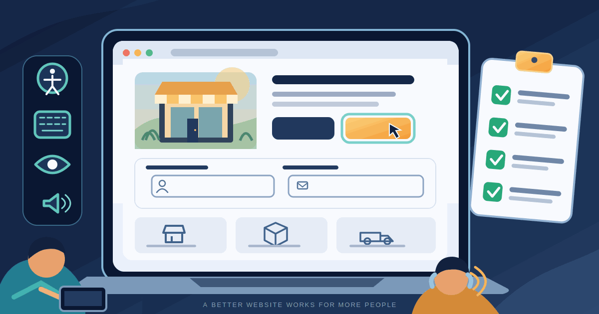
A small-business website can look polished and still make it difficult for some customers to contact you, book a service or complete a purchase. A menu that only works with a mouse, pale text on a bright background, an unlabeled enquiry field or a checkout button that cannot be reached by keyboard can turn an ordinary visit into a dead end.
Website accessibility means making information and tasks usable by people with different visual, hearing, mobility, speech and cognitive needs. It also helps people dealing with temporary injuries, glare, a noisy environment, a small screen or an unreliable connection. Accessibility is not a decorative feature to add after a redesign. It is part of whether the website does its job.
This guide gives small businesses a practical way to review the pages that matter most, understand the main WCAG 2.2 checks and plan improvements without assuming that every problem requires a new website. It is implementation guidance, not a legal opinion or a certification of conformance.
1. Choose a clear accessibility target
The Web Content Accessibility Guidelines (WCAG), published by the World Wide Web Consortium (W3C), provide testable criteria for making web content more accessible. A sensible starting target for a business website is WCAG 2.2 Level AA. It is a practical benchmark for planning and reviewing a site, not a guarantee that every visitor will have an identical experience.
Level AA builds on Level A: a claim of AA conformance means the applicable A and AA success criteria are met across the defined scope. It is not enough to run one page through a checker or to make the homepage look accessible. The contact form, booking flow, product pages, account screens, checkout, embedded tools and error states matter too.
WCAG 2.2 also addresses issues that are easy to miss in a visual review, including keyboard focus being hidden by sticky content, controls that are too small or close together, and interactions that require dragging without another way to complete the task. Check the actual criteria in the W3C WCAG 2.2 specification rather than relying on a badge or a score.
Legal obligations differ by country, sector, customer type and the services a business provides. A technical checklist cannot determine your legal position. If a contract, public-sector requirement or local accessibility law applies, confirm the relevant standard and scope with an appropriately qualified adviser.
2. Start with the journeys customers need to complete
Do not begin by checking every page in the same order. First write down the actions that create value for the business and the customer. For a service company, the important journey may be finding a service, understanding the price or coverage area, and submitting an enquiry. For an online shop, it may be searching, choosing a product, adding it to the basket and paying. A clinic may need appointment booking, location details and clear preparation instructions.
Choose representative pages for each journey, including at least one page with a form or interactive control. Include mobile layouts and any third-party booking, payment, chat or map component. A website can be accessible until a customer reaches an embedded widget that has different controls and keyboard behaviour.
3. Work through this practical website accessibility checklist
Make the page structure understandable
- Give each page a useful, distinct browser title that describes its purpose.
- Use headings in a meaningful hierarchy. A heading should describe the section that follows, not just make text larger or bolder.
- Use proper page regions for the header, navigation, main content and footer. Provide a way to skip repeated navigation and reach the main content.
- Write link text that makes sense when read on its own. Replace repeated labels such as “click here” with a destination or action.
- Set the page language correctly and keep the reading order logical when the layout is viewed without its styling.
These choices help screen-reader users move through a page and help other visitors scan it. The W3C Page Structure Tutorial explains headings, landmarks and meaningful content structure.
Make every important action work without a mouse
Put the mouse aside and use the Tab and Shift+Tab keys to move through the page. Use Enter or Space to activate controls where appropriate, and Escape to close menus or dialogs when that is the expected behaviour.
- Every link, button, menu, form field and important widget should be reachable and operable from the keyboard.
- The focus indicator must be visible. Do not remove the browser outline unless you replace it with a clear, high-contrast indicator.
- Focus should move in a sensible order and should not become trapped inside a menu, pop-up or chat widget.
- When a dialog opens, move focus into it, keep interaction inside it while it is open, and return focus to the control that opened it when it closes.
- Check sticky headers, cookie banners and fixed footers. They must not completely cover the item that currently has keyboard focus.
WCAG 2.2 includes the Level AA criterion Focus Not Obscured (Minimum). A common failure is a sticky banner covering the focused link near the bottom of the screen. The W3C explanation of Focus Visible is also useful when reviewing keyboard operation.
Keep text readable and information independent of colour
Text needs enough contrast against its background. WCAG 2.2 Level AA generally requires a contrast ratio of at least 4.5:1 for normal text and 3:1 for large text, subject to the standard's defined exceptions. Check the actual foreground and background colours; a design that looks readable on one monitor may be difficult to read on a phone outdoors.
- Do not use colour as the only way to show a required field, an error, a successful payment or an unavailable option. Add text, an icon with an accessible name, or another clear signal.
- Do not put important instructions inside images when the same information can be real text.
- Allow text to resize and pages to reflow at narrow widths without forcing visitors to scroll in two directions for ordinary content.
- Check text over photographs, gradients and coloured buttons, not only the plain body background.
Use a contrast checker to identify likely problems, then inspect the real page states: hover, focus, disabled, error and success. Do not choose colours by appearance alone.
Give images useful text alternatives
Alternative text should communicate the information or function of an image in its context. It is not a place to repeat keywords or describe every visual detail.
- For an informative product or service image, describe the detail a customer needs to understand.
- For a decorative flourish that adds no information, use an empty alternative such as
alt=""so it does not create unnecessary screen-reader noise. - For an image that acts as a link or button, describe the action or destination, not merely what the icon looks like.
- For a chart or diagram, provide the important data or explanation in nearby text as well as an appropriate short alternative.
For example, “Blue ceramic travel mug with a leak-resistant lid” is more useful on a product page than “product image”. The right description depends on what the surrounding text already explains. The W3C Images Tutorial includes examples for informative, decorative, functional and complex images.
Make enquiry, booking and checkout forms easy to complete
Forms are often where an inaccessible website loses a real customer. A field that visually says “Email” only as placeholder text may become unclear when the placeholder disappears or is not announced as a label by assistive technology.
- Give every field a visible, programmatically associated label. Use placeholder text only as an example or hint, not as the only label.
- Explain required information, accepted formats and any important limits before the visitor submits the form.
- Group related options and identify radio buttons or checkboxes clearly.
- When validation fails, explain what went wrong in text, identify the affected field and tell the visitor how to fix it. Do not rely on a red border alone.
- Preserve information that the visitor has already entered when a correctable error occurs.
- Keep the form as short as the task allows. Do not request information that is not needed to respond, book or complete the purchase.
Test the complete journey, not just whether the submit button works. Submit an empty form, enter an invalid email address, correct an error, use autofill and complete the form with a keyboard. The W3C Forms Tutorial covers labels, instructions, grouping and validation. Once the form is usable, a separate measurement plan can help you understand successful enquiries; see our small-business website lead-tracking guide.
Make mobile controls practical to tap
Small, tightly packed controls are difficult for people with limited dexterity and for anyone using a phone while moving. WCAG 2.2 Level AA's Target Size (Minimum) criterion generally calls for pointer targets of at least 24 by 24 CSS pixels, or sufficient spacing between smaller targets, with defined exceptions. This is a minimum criterion, not a recommendation to make every important button only 24 pixels wide. Larger, well-spaced controls are often easier to use.
If a task uses dragging, provide a simple single-pointer alternative where the action does not genuinely require dragging. A file-upload area should also have a normal “Choose file” control; a map or slider should not assume every visitor can drag accurately. Do not make essential information or controls appear only on hover.
Provide alternatives for audio and video
When a prerecorded video contains speech or other audio needed to understand it, provide accurate synchronized captions. Captions should include relevant speaker changes and meaningful sounds, not just rough auto-generated words. Audio-only content such as a podcast needs a text transcript. Make sure the media player itself can be operated with a keyboard and that controls have clear names.
If video communicates important visual information that is not spoken, consider whether audio description or a descriptive transcript is needed. The W3C Captions and Subtitles guidance explains the purpose and requirements of captions.
4. Use automated tools, but do not treat a score as proof
Automated accessibility checkers can quickly identify some common problems, such as missing accessible names, certain contrast failures and invalid markup patterns. Run one on the homepage and on representative service, product, form and checkout pages. A browser-based audit is a useful first pass, especially when a website changes frequently.
Automation cannot reliably decide whether an alternative text description is meaningful, whether the heading order explains the page, whether an error message is understandable, or whether a person can finish a real booking. W3C is explicit that no single evaluation tool can determine whether a site is accessible; knowledgeable human evaluation is required. A high automated score is a signal, not proof of an accessible customer journey.
Use three layers:
- Automated checks: run a reputable checker and record the page, issue and affected component.
- Manual checks: navigate with a keyboard, zoom the page, test narrow screens and complete every important form or purchase step.
- Assistive-technology and user checks: where possible, test with a screen reader and include people with disabilities in usability sessions. Their feedback can reveal barriers that a checklist will not predict.
For a more formal review, W3C's WCAG Evaluation Methodology overview describes how to define the scope, select representative pages, evaluate them and report findings. It is a structured evaluation approach, not an automated certification button.
5. Fix problems in the order that protects customer tasks
A long issue list can make accessibility work feel expensive. Prioritise by the consequence for the person trying to use the site.
- Fix first: barriers that prevent someone from contacting the business, booking, paying, signing in or reaching essential information. Examples include a keyboard trap, an unlabeled submit button or a form that cannot be completed without a mouse.
- Fix next: problems that make a task error-prone or unnecessarily difficult, such as low-contrast text, unclear validation, tiny controls or focus hidden behind a banner.
- Improve continuously: heading consistency, link wording, image alternatives, captions, content clarity and less frequently used pages.
Assign an owner and a due date to each issue. Record the affected page, the steps that reproduce it, the expected behaviour and how the fix will be retested. A screenshot alone is rarely enough to explain a keyboard or screen-reader problem.
6. A manageable 30-day improvement plan
- Week 1 — map and review: list the key customer journeys, choose representative pages, run an automated scan and complete a keyboard-only walkthrough. Record the issues that block important tasks.
- Week 2 — remove structural barriers: fix page headings, landmarks, link names, keyboard access, focus visibility and controls hidden by sticky elements.
- Week 3 — improve customer interactions: review contrast, image alternatives, form labels, validation messages, mobile target sizes and media captions.
- Week 4 — retest and make it routine: repeat the same customer journeys, test the fixes on mobile and desktop, review any third-party components and add accessibility checks to the website's normal content and release process.
This is a practical starting schedule, not a promise that every site can reach WCAG 2.2 AA in four weeks. A large catalogue, custom application or inaccessible third-party booking system may need a longer project and specialist support.
7. What to ask a website designer or development provider
If you are commissioning a new website or paying for a redesign, make accessibility part of the scope before approving the work. Ask the provider:
- Which WCAG version and conformance level will the work target?
- Which pages and user journeys will be tested, including forms, checkout and mobile layouts?
- Will testing include keyboard operation and assistive technology, or only an automated score?
- How will third-party booking, payment, chat and embedded services be assessed?
- Will you receive an issue list, evidence of retesting and a clear statement of what was and was not evaluated?
- Who is responsible for accessibility when new content, plugins or features are added?
Budget depends on where the barrier lives: editing alternative text or a field label is different work from rewriting a custom booking widget or replacing an inaccessible third-party service. Ask for separate estimates for content fixes, template changes, custom components, independent testing and ongoing regression checks. This makes the trade-offs visible and helps avoid paying for a broad redesign when a focused repair will solve the problem.
A theme, page builder, plugin or accessibility widget does not automatically make the finished site accessible. The result depends on the content, configuration, custom code and third-party services. A provider should explain the work and its limits rather than promise instant compliance.
8. Measure whether the experience is improving
Track both accessibility defects and the customer tasks they affect. Useful measures include the number of high-priority issues still open, time to resolve them, form validation errors, successful booking or checkout completion, support requests about website usability and feedback from user testing.
Compare the same journeys before and after a change, and be careful about cause and effect. A higher conversion rate may also reflect a campaign, price change or seasonal demand. Accessibility work should not be judged only by revenue: the ability to access information and complete a task is valuable in its own right.
Review accessibility whenever you add a new template, campaign landing page, form, product catalogue, video player or third-party integration. Small checks during normal maintenance are usually easier to manage than discovering that a critical customer journey needs to be rebuilt.
Conclusion
A more accessible website does not have to begin with a full redesign. Start with the actions customers need to complete, make the structure understandable, support keyboard operation, use readable contrast, describe meaningful images, label forms properly and test the mobile experience. Then use automated tools as one part of a broader review that includes real interaction and, where possible, feedback from people with disabilities.
The most useful goal is not a perfect-looking score. It is a website that lets more people find information, understand their options and complete the task they came to do. Make that part of the way the business maintains its website, not a one-time project.
Further reading
Related articles
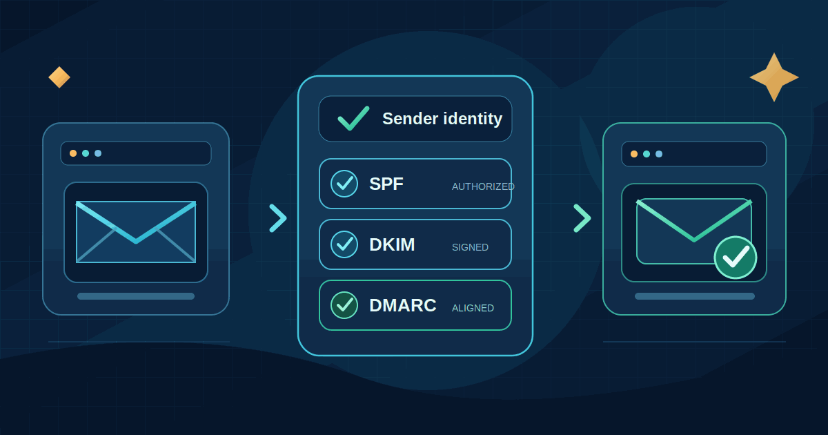
Why Business Emails Land in Spam: A Practical SPF, DKIM and DMARC Guide
Learn how small businesses can improve email deliverability with SPF, DKIM, DMARC, one-click unsubscribe, list hygiene and practical monitoring.
Read article
Website Lead Tracking for Small Businesses: A Practical GA4 Guide
Learn how to measure real website enquiries from forms, phone calls and WhatsApp—not just traffic—with GA4, campaign tags and CRM feedback.
Read article
Passkeys for Small Businesses: A Practical Rollout Guide
A practical guide to adopting passkeys in a small business: choose the right credential, protect administrator accounts, plan recovery, and avoid sign-in disruption.
Read articleLet's talk
Have an idea? Let's figure out how to build it.
You don't need a technical specification or a perfectly defined plan. Tell us what you're trying to achieve, and we'll help identify the next steps.